Behind the Artefact: Gothic Tracery
Arcanium Studios · Behind the Artefact
Gothic Tracery Studies
Two contemporary pendant studies — select an object to read its research boundary
These pendants are original contemporary studies in the geometry of Gothic window tracery. They do not reproduce named historic windows, period jewellery or stained-glass panels. The historic language is evidence; the printed objects are interpretations.
Round Tracery Study
Contemporary interpretation · geometric-tracery vocabulary
The circular study uses openwork circles, pointed forms and trefoil-like openings. It is an original composition informed by forms documented in Gothic window tracery; it is not a replica of a rose window.
1 · Trefoil-like opening
A trefoil is a three-lobed foil. The pendant borrows this visual vocabulary, but the exact pendant geometry and jewellery setting are contemporary.
2 · Circular geometry
Early Gothic bar tracery used circles and inner cusping to shape window openings. This study translates that circle-led logic into openwork.
3 · Framework, not stained glass
Tracery is the architectural framework. Historic stained-glass panels were separate leaded glass assemblies fitted into those openings.
Pointed Tracery Study
Contemporary interpretation · Decorated-tracery vocabulary
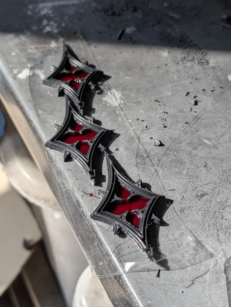
The pointed study is an original arrangement of elongated, lobed and pointed voids. It is inspired by the experimental forms of Decorated Gothic tracery, not a reconstruction of a named “Gothic dagger,” reticulated window or period pendant.
1 · Pointed and lobed forms
From the end of the 13th century, English Decorated tracery could move beyond circle-led subdivisions to trefoils, quatrefoils and dagger-shaped forms.
2 · Exact motif names need CAD proof
A pointed silhouette alone does not prove a dagger, vesica or ogee. Technical names require the underlying curve construction, not a visual guess.
3 · Contemporary material study
Clear resin has been UV-cured in the openwork cells. Polishing and colour are later contemporary finish stages, not a reconstruction of medieval glazing.
Process record · placeholders retained
CAD → printed framework
Clear resin infill / UV curing
Polishing and colour tests
Research sources: Looking at Buildings — Gothic Windows and Tracery · Looking at Buildings — Decorated Tracery · Corpus Vitrearum USA — Stained Glass Glossary · The Stained Glass Museum, Ely.
The Object
These are two contemporary pendant studies made from Gothic window-tracery vocabulary. They begin as CAD constructions, are printed as open frameworks, then receive clear resin in selected cells. The resin has been UV-cured; polishing and colour are later process stages.
Gothic tracery may look elaborate, but beneath the ornament is remarkably simple geometry.
4-fold rotational symmetry: one quarter-turn = 90°.
Full rotation: 360° ÷ 4 = 90° per repeated unit.
Perpendicular axes: the primary construction axes meet at 90°.
Quatrefoil: classically four equal lobes arranged around a common centre. A simple construction places the centres of four equal circles at 0°, 90°, 180°, 270°.
Square connection: fourfold tracery naturally relates to the geometry of an inscribed square. Its vertices divide the circumcircle into four equal 90° arcs.
Size:77mm x 40mm x 4mm
Gothic tracery may look elaborate, but beneath the ornament is remarkably simple geometry.
4-fold rotational symmetry: one quarter-turn = 90°.
Full rotation: 360° ÷ 4 = 90° per repeated unit.
Perpendicular axes: the primary construction axes meet at 90°.
Quatrefoil: classically four equal lobes arranged around a common centre. A simple construction places the centres of four equal circles at 0°, 90°, 180°, 270°.
Square connection: fourfold tracery naturally relates to the geometry of an inscribed square. Its vertices divide the circumcircle into four equal 90° arcs.
Size:77mm x 40mm x 4mm
Reading the Framework
Tracery is the architectural framework that creates shaped openings in the upper part of a Gothic window or in a rose. Stained-glass panels are separate leaded glass assemblies designed to fit within those openings. That distinction is the starting point for these pendants: they translate the framework, not a complete historic window.
In Gothic architecture, circles, pointed arches, foils and cusps could be combined in very different ways according to period, region, building and workshop. The pendants use that vocabulary as a research prompt, not as a generic label that makes every curved opening “Gothic”.
The round study should therefore be read as a contemporary geometric-tracery interpretation. It is not a rose window. The pointed study should be read as a contemporary pointed-tracery interpretation. It is not a reconstruction of a technical “dagger”, reticulated window, or period pendant.
GEOMETRY AS METHOD
The geometry can be described precisely without inventing historical provenance.
Fourfold rotational symmetry repeats after one quarter-turn: 360° ÷ 4 = 90° per repeated sector. Four equally spaced radial directions relate to an inscribed square and divide the circumcircle into four equal 90° arcs. Bisecting each sector produces useful 45° intermediate construction lines.
Threefold rotational symmetry repeats after one third-turn: 360° ÷ 3 = 120° per repeated sector. Three equally spaced radial directions relate to an inscribed equilateral triangle and divide the circumcircle into three equal 120° arcs. Bisecting each sector produces 60° intermediate construction lines.
A trefoil or quatrefoil is more specific than threefold or fourfold symmetry. It is a lobed foil formed by cusping around a common centre. A symmetrical silhouette is not automatically a trefoil or quatrefoil; the underlying curve construction still matters.
The Build
Printed in wood-composite PLA filament — a standard PLA base with fine wood particles suspended in it. The wood content is low enough that it prints reliably on a standard FDM printer, but high enough that the surface responds to oil finishing the way real timber does.
The relief depth on the carved elements is the critical variable. Too shallow and the pattern reads as flat texture. Too deep and fine details like the rauponga fill collapse into the base layer. The version you are holding has been calibrated to sit in the middle of that range.
After printing, the surface was finished with linseed oil. The oil darkens the recesses and brings out the grain in the raised areas, making the pattern significantly more legible than the raw print. It also seals the surface.
The hole at the top is sized for a standard 4mm cord or tassel.
Attribution
The design language used in this piece is documented in:
Witehira, J.G.P. (2013). Toi Rangatira: A Māori Design Language. PhD Thesis, Massey University, Palmerston North, Aotearoa New Zealand. Available via Massey Research Online.
Dr. Witehira spent years documenting a visual language that most people walk past without recognising. This bookmark exists because of that work. A copy of this piece has been sent to him.
Arcanium Studios does not claim ownership of the design language. We are using it, sourcing it, and pointing people back to the person who documented it.
Why It Matters
Most objects that use indigenous design patterns do not explain them. They borrow the aesthetic and discard the meaning. The result is decoration that looks like it carries significance but does not.
This bookmark is an attempt to do the opposite. The NFC sticker on the back exists specifically so that the object can carry its own context. You do not need to already know what rauponga means, or why the manaia faces the way it does, or what tātai manawa is. The object tells you, if you tap it.
The Matariki Series will eventually cover all nine stars, each with its own design, its own dominant motif, and its own page. This is the first one.
Made in Sydney, July 2026. Arcanium Studios.
RAUPONGA
The Surface Fill
Rauponga is the most widely used surface-fill pattern in Māori carving. It consists of alternating rows of two simpler elements: haehae (parallel grooves cut into the surface) and pākati (dog-tooth triangles, also called niho taniwha — the teeth of the taniwha). The two patterns repeat in bands across the carved field, creating a dense, rhythmic texture that fills the space between the primary motifs.
The name rauponga refers to the layered, repetitive nature of the pattern — rau meaning leaf or layer, ponga referencing the silver fern. It is the background that makes the foreground legible. Without rauponga fill, a carved composition would have large empty areas that draw the eye away from the primary motifs. With it, the entire surface becomes active.
In wood filament printing, rauponga is one of the most printable Māori patterns at small scale. The alternating relief depth — raised triangles against recessed grooves — creates shadow contrast that reads clearly even at bookmark dimensions. The oil finish darkens the recesses and makes the tooth pattern significantly more visible than the raw print.
Design principle: Tātai manawa — the continuous pulse. Rauponga maintains visual rhythm across the surface so that no area becomes visually dead. It is the connective tissue of the composition.
Matariki connection: This bookmark is dedicated to Matariki herself — the central star, governing health, wellbeing, and the natural environment. Rauponga's layered, repeating structure reflects the cyclical rhythms of the natural world that Matariki presides over.
Source: Witehira, J.G.P. (2013). Toi Rangatira: A Māori Design Language. PhD Thesis, Massey University. Chapter 5: Surface fill patterns — rauponga, pp. 118–122.
KORU COLUMN
The Continuous Spiral
The koru is the foundational curvilinear element of Māori design. It is derived from the new shoot of the ponga (silver fern) — the tightly coiled frond that unfurls as the plant grows. In Māori visual language, the koru represents new beginnings, growth, and the nurturing of life. It is the most immediately recognisable Māori motif and one of the few that has entered broad international awareness.
In the koru column bookmark, four koru spirals are arranged in a vertical sequence, each one flowing into the next. This is the design principle of tātai manawa made visible — the continuous pulse that moves through the composition from entry to exit without interruption. The eye enters at the top spiral, follows the implied flow downward, and resolves at the base. Nothing stops it.
The alternating orientation of the spirals — each one curling in the opposite direction to the one above — creates the tātai hikuwaru disruption that Witehira identifies as essential to a living composition. A column of identical spirals would be static. The alternation gives it movement.
Design principle: Tātai manawa (continuous flow) combined with tātai hikuwaru (deliberate disruption through alternating orientation).
Matariki connection: This bookmark is dedicated to Hiwa-i-te-rangi — the wishing star, the star of aspirations and goal-setting. The koru's meaning of new beginnings and growth maps directly onto Hiwa-i-te-rangi's domain. Matariki tradition holds that you speak your intentions to this star during the rising. The koru column is a physical record of that act.
Source: Witehira, J.G.P. (2013). Toi Rangatira: A Māori Design Language. PhD Thesis, Massey University. Chapter 4: Koru as primary curvilinear motif, pp. 89–94.
MANAIA — URURANGI
The Guardian in the Wind
The manaia is a profile figure that combines three creatures in one form: the beak of a bird, the body of a human, and the tail of a fish. It is a spiritual guardian — a messenger that moves between the physical world and the spiritual one, between the living and the dead. In carved compositions, the manaia often appears at the edges or flanking a central figure, watching outward, guarding the threshold.
In this bookmark, the manaia's serpentine body coils the full length of the piece, its bird-beak facing upward and its tail resolving at the base. A second, smaller manaia appears at the lower section — the deliberate asymmetric disruption (tātai hikuwaru) that gives the composition vitality. The rauponga fill covers the body, marking it as a figure of substance rather than outline.
The manaia's spiral eye is one of the most distinctive elements in Māori carving. It is not decorative — it signifies awareness, the capacity to see across the boundary between worlds. A manaia without a spiral eye is incomplete.
Design principle: Tātai rahinga — hierarchy by scale. The large manaia dominates the composition because it is the primary symbolic element. The smaller one at the base creates depth and movement without competing.
Matariki connection: This bookmark is dedicated to Ururangi — the star of winds. The manaia is the messenger, the one who moves between realms. Wind is the medium of that movement. Ururangi governs the winds of the new year; the manaia rides them.
Source: Witehira, J.G.P. (2013). Toi Rangatira: A Māori Design Language. PhD Thesis, Massey University. Chapter 4: Manaia as guardian motif, pp. 101–107.
PĀTIKITIKI — TUKUTUKU
The Woven Wall
Pātikitiki is a pattern from the tukutuku tradition — the latticework panels woven from kiekie reed, muka (flax fibre), and tōtara wood strips that line the interior walls of wharenui (Māori meeting houses). The pattern consists of interlocking diagonal diamonds, created by the over-under weaving of horizontal and vertical elements. At fine scale it reads as a mesh or lattice; at larger scale the diamond shapes become distinct.
Tukutuku is significant for a reason that goes beyond the visual. In the wharenui, the carved pare (door lintel) and the carved poupou (wall posts) are the domain of men — tāne. The tukutuku panels that fill the spaces between the carved posts are the domain of women — wāhine. The two traditions are not ranked. They are complementary. The carving and the weaving are two halves of the same wall. You cannot be inside a wharenui without being surrounded by both.
This is not a historical footnote. It is a structural feature of the design tradition — a built-in acknowledgement that different forms of knowledge and labour are held in parallel, not in hierarchy. The pātikitiki bookmark carries that context with it.
Design principle: Tātai hangarite — the bilateral symmetry of the woven grid. Every intersection is governed by the same rule. The pattern is democratic in a way that carved motifs are not.
Matariki connection: This bookmark is dedicated to Waitī — the star of freshwater environments, rivers, and lakes. Tukutuku panels are woven with materials drawn from freshwater margins: kiekie grows along stream banks, flax thrives in wetlands. The weaving tradition and the water domain share the same source.
Source: Witehira, J.G.P. (2013). Toi Rangatira: A Māori Design Language. PhD Thesis, Massey University. Chapter 5: Tukutuku and woven pattern traditions, pp. 130–135.
Note on tukutuku gender roles: This is a well-documented aspect of Māori material culture. For further reading see: Te Ara — The Encyclopedia of New Zealand, "Weaving — raranga and whatu," and Mead, H.M. (2003). Tikanga Māori: Living by Māori Values. Huia Publishers.